Wednesday, 21 October 2009
Evaluation - 4.) What have you learn about technologies from the process of constructing this product?
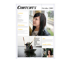
One of the main technologies we used and have learnt about from developing our media product is Photoshop. Beforehand I honestly knew nothing about it, but now I'm able to use different tools such as stamp tool, clearing blemishes and maybe even giving the model another piercing. I also learnt through research how professional magazines use Photoshop to make models look more glamorous and sexy, such as making their feet bigger in order to allow their legs to look longer. When we were creating our contents page we used a programme called Quark Express, we use margins, text boxes, pictures, small font etc… All things we had learnt from looking at other contents pages and their layouts; e.g. 2 column contents, 3 column etc… Even though most people know how to use digital cameras for our mid-close up photo we had to learn how to use a professional digital camera which most of us hadn't used before; we looked at the flash, zoom and took practice images so we were able to get a perfect medium-close up of our model. There was also the case of creating files and naming them correctly so we were able to access and find our work quickly and easily. Finally, we created our online blogs on blogspot.com, this is something I had previously used so I was able create my blog and access it quite easily. We put our work on our blogs so we are able to look at older pieces to remind and revise from.
Evaluation - 3.) How did you attract/address your audience?
In order to attract our audience we used a number of different media conventions which we had discovered during our research period, for example; mast head, main sell, sans serif font etc… We used a colour scheme of blue, red and black, if we had not done this I think it would have looked messy and put the audience off. The layout was simple and sweet, so the audience knows what they are getting, it's also pretty laid back which would appeal to our target audience, especially underachieves and radicals. Given that it is a student magazine, our medium close-up cover shot is of a student in the library, (a little bit cliché I know) because we needed a way of telling the audience it was a student magazine. To let our audience know our music magazine was a bit radical and unique, we chose our particular model because she looked slightly more unconventional than other people, with her face piercings and black leather jacket, she has a sort of rocker look about her. When it came to addressing our audience we got straight to the point, we told them about our freebie and about the magazine's main sell, although I think we could have been a bit more inventive with how we sold the magazine, but once again it goes back to the point of our target audience.
Evaluation - 2.) Who would be the audience for your media product?
When it comes to social values our audience would be post-modernists, this is because the magazine is for people who like to live for today and enjoy the things they have now, they just want a good time, maybe go to some gigs and have a few drinks. For psychographics, we would include aspirers; people who want to climb up the social scale, buying a magazine about latest music/film/gigs would help you to do this, radicals; people who think they're really individual, our magazine focuses on mainstream and underground music/films, and finally underachievers; people who may be well informed/educated but not very ambitious, sitting around all day, reading a magazine, listening to music and watching films. The age range for our media product would be 16-19, this is partly because it's designed by people of a similar age, so we are playing to our strengths by creating a piece which we'd like to read. 16-19 year olds are also the biggest consumers when it comes to purchasing music and going to the cinema, so a magazine about these two industries is the sort thing they'd want to read.
Evaluation - 1.) In what ways does your media product use, develop or challenge forms and conventions of real media products?
My magazine front cover and contents page uses many conventions of real media products, such as mast head, main sell, cover lines, freebies, barcode, mid-close up photo etc… By looking at other magazine front covers and contents pages we were able to understand the denotations (describing literally what you see) and connotations (what you associate with the denotation). By using what we had learnt from the denotations and connotations of other media products, we were able to create a front cover and contents page which was similar to those of a professional standard, and yet add our own slant and style. At first glance our front cover appears to be very simple and plain, so you may believe it doesn't challenge forms and conventions of real media products, however, by producing a plain and simple front cover I believe we are challenging professional media products. Professional media products seem to feel the need to cram as much as they can onto their cover and in your face, whereas we have decided to take a more laid back approach, we're not forcing it at you, people can read it if they wish, I think this attitude is perfect for our target audience.
Subscribe to:
Comments (Atom)


