Thursday 17 December 2009

Main task: Detailed analysis of music magazines

Magazine: Q

Genre: Indie, pop, rock and classic rock.

Audience: 21 – 35, succeeders, carers, traditionalists (psychographics) as well as post-materialists (social values). JICNAR SCALE: B – Intermediate managerial, administrative and professional (GPs, teachers) / C1 – Supervisory, clerical, junior administrative or professional (work in offices).

Title: Simple, no stupid titles or puns – just straight to the point. Also a well know and trusted name.

Style: A red, black and white colour scheme (simple) with the known Q logo at the top left hand corner. Layout quite plain – established magazine doesn’t need to really capture the audience’s attention because it already has a group dedicated readers.

Content: You’d expect to find features and articles about classic artists (Paul McCartney, Robert Plant) as well as other major/mainstream more recent artists (Kings of Leon, Lily Allen). Quite often issues featuring things like ‘Top 50 greatest albums of all time’ or ‘100 greatest songs of the decade’ etc…

Mode of address: Q uses a simple and straightforward language in order to appeal to its demographic and also a wider audience; anybody could pick it up and understand what they’re blabbing on about. They also quote interviews with artists (normally something a bit extreme or unusual) in order to attract the reader, for example; “I save all my beard clippings in a bag to send to Neil Tennant” – Brandon Flowers. These quotes often sum up that person and their style of music e.g. When you think of Billie Joe Armstrong, you think of his band and lyrics which are strongly against the old republican government, so they use this quote: “If I went for a beer with Bush, hopefully I’d have a gun on me.” Very funny, even if it does contradict everything he supposedly believes in, but what else could you expect from a sell out?

Photographs: The photographs within Q magazine are pictures of well known and established (sometimes up and coming) British and American musicians, these artists often integrate and have special features where a new artist will interview a “legend” and vice versa. A lot of these pictures are taken in a studio with a simple backdrop (white or black), the musicians don’t tend to smile and look very serious because that’s what Q would like people to think it is; a serious music magazine. This represents the artists in quite a serious, noble and pretentious light; to some they would seem impressive and mighty, but to others they just look ridiculously snobbish and up themselves.

Contents page: The contents page includes or the main artists within its big feature (“Artist of the Century”) it also shows regular features and a special review. At the top right hand corner it displays the front cover and at the bottom right hand corner it reveals a page deep within the actual magazine. Q uses a 3 column contents page.

Double page spreads: One the first page, it includes a big statement in a sans serif font, then three columns of the beginnings of an article. On the second page there is a collage of images representing the Noughties; music, media, politics and so on. It combines simplicity and words with a clash of colour and photographs.

An example of the kind of band you'd find in Q:

Tuesday 8 December 2009

Main task: Analysis of a range of music magazines

Title: NME
Audience: 16 - 26 year old aspirers and radicals, hedonists and post-modernists.

Main contents: New, up and coming indie bands (from around the world, but mainly english), as well as bigger acts e.g. Lady Gaga, Eminem etc...
Brand identity: An informal magazine for a younger teenage audience who want to hear more underground music but with a sprinkling of mainstream. A magzine for people who enjoy popular music, but don't neccesarily take it seriously.


Title: Classic FM
Audience: 26-50 year old succeeders, carers, traditionalists and achievers.

Main contents: A mixture of classic composers/musicians as well as new and up and coming composers/musicians (new artists playing old music). It looks like they're trying to make classical music (which is generally consider to be something middle/upper class older people listen to) into a "cool, modern and sexy" genre. Which is why you'll find people like Myleene Klass on the front cover - a modern audience recognise her and like her, she appeals to a younger target audience.

Brand identity: A formal and sophisticated magazine for older classical music lovers, but also a magazine for younger students perhaps - this is certainly what the denotations and connotations tell us.


Title: Top of the Pops
Audience: 8-14 year old aspirers and underachievers, post-materialists and hedonists.
Main contents: Mainstream, generic artists produced only to make money - all the artists they use have a squeaky clean image and child friendly lyrics, the chances of finding a band who fight dominant ideologies (e.g. Fucked Up), is hugely improbable. They all fit into Theodore Adorno's idea that the products of the culture industries are formulaic, simplistic and emotive - they are pseudo-individualist artists, produced by major record labels.

Brand identity: A downmarket publication for younger people who enjoy mainstream artists, watch mainstream television (e.g. X Factor) and film.

Main task: Magazines

The main objective of this task is to create the front page, contents and double page spread of a new music magazine. All content must be original and created by the individual, e.g. photos taken by yourself, arcticle written by yourself etc...

Deadlines:
  • 8th January 2010 - Research and planning
  • 12th January 2010 - Production
  • 12th February 2010 - Post-production
  • 5th March 2010 - Evaluation

I intend to start the work early in order to complete the task on time, efficiently and to a high standard. I hope to produce an imaginative and unique magazine.

Wednesday 21 October 2009

Evaluation - 4.) What have you learn about technologies from the process of constructing this product?

One of the main technologies we used and have learnt about from developing our media product is Photoshop. Beforehand I honestly knew nothing about it, but now I'm able to use different tools such as stamp tool, clearing blemishes and maybe even giving the model another piercing. I also learnt through research how professional magazines use Photoshop to make models look more glamorous and sexy, such as making their feet bigger in order to allow their legs to look longer. When we were creating our contents page we used a programme called Quark Express, we use margins, text boxes, pictures, small font etc… All things we had learnt from looking at other contents pages and their layouts; e.g. 2 column contents, 3 column etc… Even though most people know how to use digital cameras for our mid-close up photo we had to learn how to use a professional digital camera which most of us hadn't used before; we looked at the flash, zoom and took practice images so we were able to get a perfect medium-close up of our model. There was also the case of creating files and naming them correctly so we were able to access and find our work quickly and easily. Finally, we created our online blogs on blogspot.com, this is something I had previously used so I was able create my blog and access it quite easily. We put our work on our blogs so we are able to look at older pieces to remind and revise from.

Evaluation - 3.) How did you attract/address your audience?

In order to attract our audience we used a number of different media conventions which we had discovered during our research period, for example; mast head, main sell, sans serif font etc… We used a colour scheme of blue, red and black, if we had not done this I think it would have looked messy and put the audience off. The layout was simple and sweet, so the audience knows what they are getting, it's also pretty laid back which would appeal to our target audience, especially underachieves and radicals. Given that it is a student magazine, our medium close-up cover shot is of a student in the library, (a little bit cliché I know) because we needed a way of telling the audience it was a student magazine. To let our audience know our music magazine was a bit radical and unique, we chose our particular model because she looked slightly more unconventional than other people, with her face piercings and black leather jacket, she has a sort of rocker look about her. When it came to addressing our audience we got straight to the point, we told them about our freebie and about the magazine's main sell, although I think we could have been a bit more inventive with how we sold the magazine, but once again it goes back to the point of our target audience.

Evaluation - 2.) Who would be the audience for your media product?

When it comes to social values our audience would be post-modernists, this is because the magazine is for people who like to live for today and enjoy the things they have now, they just want a good time, maybe go to some gigs and have a few drinks. For psychographics, we would include aspirers; people who want to climb up the social scale, buying a magazine about latest music/film/gigs would help you to do this, radicals; people who think they're really individual, our magazine focuses on mainstream and underground music/films, and finally underachievers; people who may be well informed/educated but not very ambitious, sitting around all day, reading a magazine, listening to music and watching films. The age range for our media product would be 16-19, this is partly because it's designed by people of a similar age, so we are playing to our strengths by creating a piece which we'd like to read. 16-19 year olds are also the biggest consumers when it comes to purchasing music and going to the cinema, so a magazine about these two industries is the sort thing they'd want to read.

Evaluation - 1.) In what ways does your media product use, develop or challenge forms and conventions of real media products?

My magazine front cover and contents page uses many conventions of real media products, such as mast head, main sell, cover lines, freebies, barcode, mid-close up photo etc… By looking at other magazine front covers and contents pages we were able to understand the denotations (describing literally what you see) and connotations (what you associate with the denotation). By using what we had learnt from the denotations and connotations of other media products, we were able to create a front cover and contents page which was similar to those of a professional standard, and yet add our own slant and style. At first glance our front cover appears to be very simple and plain, so you may believe it doesn't challenge forms and conventions of real media products, however, by producing a plain and simple front cover I believe we are challenging professional media products. Professional media products seem to feel the need to cram as much as they can onto their cover and in your face, whereas we have decided to take a more laid back approach, we're not forcing it at you, people can read it if they wish, I think this attitude is perfect for our target audience.

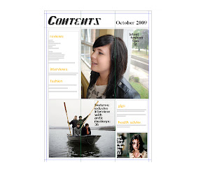
Contents page for magazine


Magazine front cover


Tuesday 29 September 2009

Student magazine front cover analyses

Soup magazine

Denotations: A gas meter in the background, a tin of soup cooking on red grill in front of an old radio, serif font, black, white and red colours used. Red circles and black graphic in the background.


Connotations: Quite an artistic front cover (magazine for artists), which summons up images of poor living conditions and old technology - which would be the case we artist considering they often make little. (A magazine for the economically unstable?) It could be that, or it could just be a pretentious and frivolous art magazine for people who like to think they're cultured.

This magazine is for radicals and maybe underachievers. For radicals, because they consider themselves as individual and unique (this magazine front cover is quite distinct). You could argue that it's also for underachievers because the tinned soup and old radio suggest quite a simple and dull life, they can't be bothered to cook a proper meal (artists being more creative than domesticated.) The old radio could show that this magazine is also for traditionalists. Maybe for people who are post materialists as well, because they want to make something of their lives in years to come.
Age group 18-26
Ammunition magazine


Denotations: Female model lying down in a white background with blonde hair and black streaks wearing a black and white dress with silver earings. The mast head is a sans serif font for all the text, and 'UNI' is in red compared to the rest of the masthead which is black. There is a red, white and black colour scheme for the cover.
Connotations: A stylish University magazine, which is very classy. It's British magazine because it says "Proud to be British." It seems to be for people who enjoy alternative music and alternative comedy, yet still enjoy Britains older culture. For anyone who enjoys films, music, television, fashion and so on.
For aspirers because this magazine seems quite glamourous and middle class, they want to climb up the social ladder. Also for radicals because it discusses lesser know musicians such as 'Dan le sac vs Scroobius Pip' who are generally consider to be quite an underground duo. These people are potentially post materialists because they want to be something later in life.
Age group 20-26


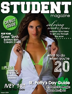
Student magazine


Denotations: Green background with a woman in a white shirt and lime green bikini, she has long brown hair and she is opening the collar of her shirt. White and green colour scheme. Green circle with 'Debut Issue' written inside it, a green clover behind some text.
Connotations: Quite a simple front cover with a white and green colour scheme. It could be a British magazine, but the font for the mast head looks like the sort of thing sporty people in America use. It's obviously for people who want a good time, enjoy drinking and clubbing etc... The enthuses on St. Patrick's Day supports this concept.
Post materialists and hedonists would read this because they enjoy life and want things now. Traditionalists and underachievers could also read this because St. Patrick's Day is a famous tradition, as well as underachievers, who enjoy a good time and getting drunk.
Age:20-26